User, have you ever been experienced?

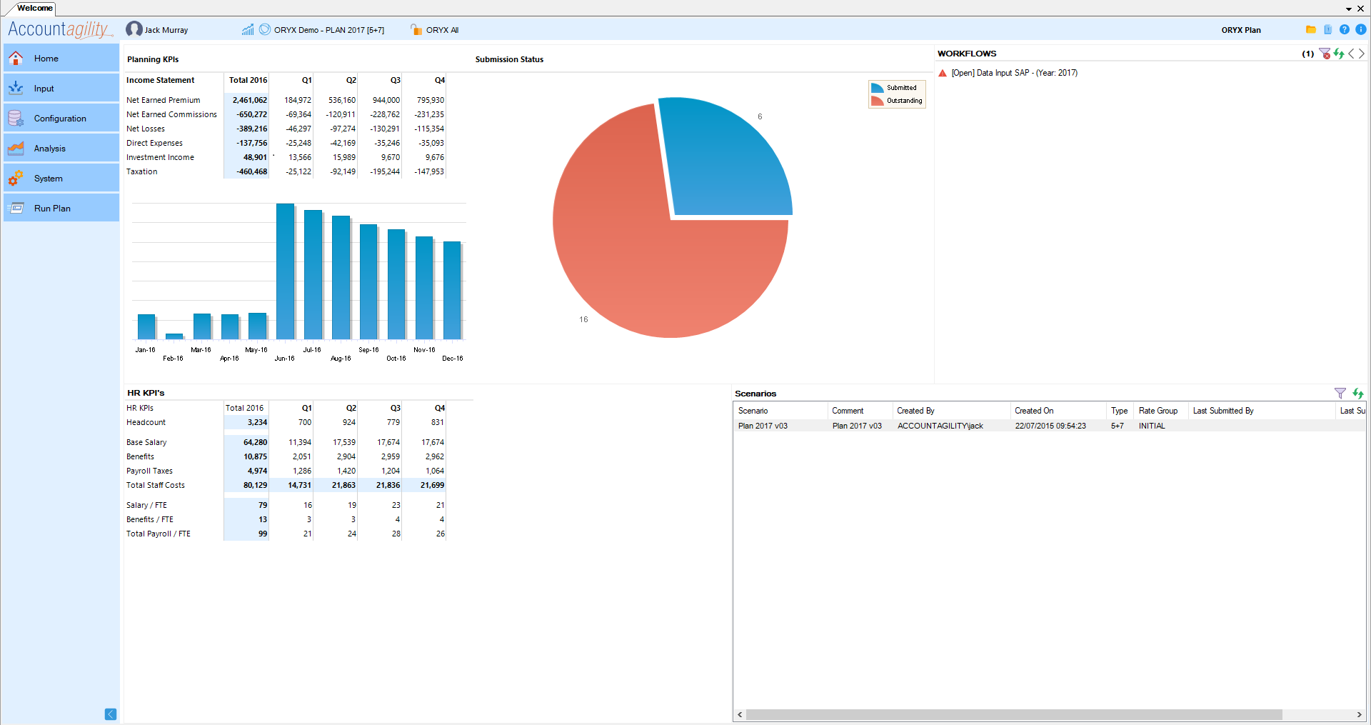
A colleague recently sent me the following picture. It appears to have done the rounds on the internet already, but I’d not seen it – and it sparked an idea.

“User Experience” and “User Interface” are two terms that people use interchangeably fairly often. If you read my last blog however, you will know that these terms mean very different things! Previously I used the analogy of a park, where the “pieces” of park such as the road or gate represent your UI, and the layout of those elements were your user experience. This image is a perfect example of the two working together – badly!

“If the user isn’t having a good experience, your clients aren’t just going to circumnavigate your bad design and carry on. They’re going to go to your competitors!”

“Desire-paths” as I’ve discovered they’re called – thanks to reddit.com/r/desirepaths – are an interesting expression of human nature overcoming boring design. I strongly encourage you to have a look at the link (warning: it’s a bit of a time-sink). When you apply this to software design however, a crucial difference must be observed: if the user isn’t having a good experience, your clients aren’t just going to circumnavigate your bad design and carry on. They’re going to go to your competitors!

What we can learn from an example like this is that good UX design should be built around the needs and wants of its user-base, rather than dictate to them. If your users are wrestling with your designs or employing unconventional methods to achieve their work, you need to acknowledge this and begin to adapt your design to meet those needs. This User-Centric methodology is an iterative process, and this diagram from Interaction Design outlines this designer’s journey perfectly:

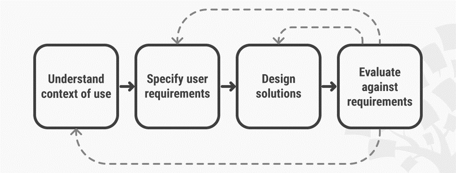
The way Accountagility works with its clients gives us an absolutely invaluable insight into how our product is being used. When designing a particularly complex new feature or defining some new business logic, our clients are often found in our offices sitting with a set of dedicated developers. This builds a symbiotic relationship for both parties; our clients receive one-on-one consultation and our developers and designers get to see first-hand how ORYX systems are being used in the real world. This allows us to “Evaluate against requirements” and see what steps need to be taken next. Are we able to design a solution for their requirements immediately? Or do we need to evaluate further with a workshop to understand the context of their use and outline their requirements? This research is fed back to our wider team and enables improvements across the whole system.

This research lets us create and map out “User Personas”, fact sheets capturing a number of key attributes about archetypical “users”. As our core users are in the finance function, we create personas for the FD, CFO, Accountant, Junior Accountant etc. We then map out user journeys for each of those personas, getting a feel of their day to day tasks, workflows, and how they get from point A to point B.

“If you get the UX right, your users won’t have to forge their own path.”

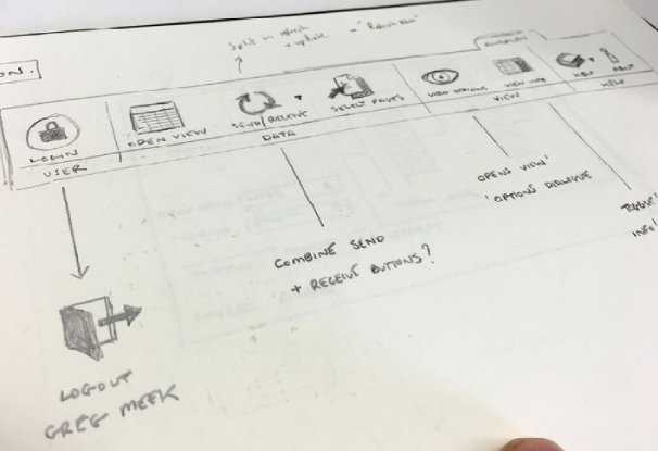
With these personas in mind, our designers then sketch wireframes, a visual guide depicting the page layout, content, interface elements and navigational system. Wireframes lack the typographic style, colour and graphics since the main focus lies on functionality, behaviour and priority of content. Functionality changes can also be improved quickly, adding more clear Call-to-action elements, drag-and-drop modules, switching the navigation, making the page more scan-able etc.

With these wireframes tested and approved, you can start to add branding elements, focussing on style, colour, and tone, bringing us full circle back to UI!

Hopefully this gives you an idea of not only the importance of the User Experience, but the value of – and amount of effort required –delivering a great UX cannot be understated. If you get the UX right, your users won’t have to forge their own path.”

How to Improve your UI and Influence People

As I started my career in presales, I inherited a venerable but rather large portable device that resembled something between Chandler’s laptop from Friends and the Monolith from 2001. The first client I showed our product to politely watched me place the machine down with a ceremonious thud. However, his most affecting comments were about the product itself. He was in total agreement that while the software was feature-rich and clearly up to his business needs, the look and feel of software was rather dated, making our offering very hard to sell internally. Something needed to be done, and quickly. Before we were back in the office we’d put in a request for a brand new Microsoft Surface: touchscreen, razor-thin, sleek and sexy.

One problem solved. Next was the UI and UX.

Before we go on, the question I should address is: what is the difference between UI and UX? These words are often used interchangeably, but they refer to very specific aspects of design. A good way to distinguish them is to imagine a park. UI refers to the individual pieces that make up the park: the benches, the trees, the paths and so on. UX refers to the general feelings you get from using the park and from how those elements are laid out: the view from the benches, where the paths lead you, and the distance between the drinks machine and the toilet.

Hopefully this highlights the importance of a good UI: a park might have best layout in the world but if the trees are dead and all the ducks are those geese that bite your fingers, no one will stay very long. Try and put yourself in the end-user’s position. Imagine seeing a product that offers a truly unique service or has enormous potential for your business, but is lacking in design, is a misery to use, or is just plain ugly. Would you stick around? Or start looking at other options?

A good UI is an absolutely essential part of the success of your product, and therefore your business. In an ever-growing software market, the pressure to stand out from the crowd becomes paramount. Features might be what draw customers to you in the first place, but the details are what keep them happy and coming back for years down the line. No matter what you’re offering, how you present your offering is what matters the most, something I found out to my cost with that client I spoke to back at the start of my career.

Since then, Accountagility have been on an impressive journey to overhaul our UI offerings. We began by aligning our rebranding efforts with the product, developing primary and secondary palettes of colour to give our ORYX product a new coat of paint. The primary palette creates our overall tone and let us harmonise our products across the web, tablet and desktop. We used secondary colours to support the primary palette, and add splashes of colour to signpost extra detail where needed. This was completed with our new logo, a much more modern and sleeker piece than its predecessor.

Buttons, icons, and fonts also enjoyed a critical rethink, along with their size and positioning. Guiding the user through the product can be done both subtly and effectively with the correct ideas guiding your design, which is where the UX comes into play. This is something I’ll be talking about next time, so join me then.

Thanks for reading!

Much Ado about Image

To who ever may have stumbled across this, welcome! With the deluge of columns and articles published online these days, I want to thank you for taking the time out of your day to stop by and to read my column. My name is Jack Murray and I’ve been the Pre-Sales Manager at Accountagility for eight months now, after two years here as a Solutions Developer.

As another year approaches its end – a fact I find hard to believe, despite its stunning regularity – Accountagility are looking ahead to the future. We will soon be completing the final stages of a company rebranding programme, and are gearing up to release ORYX 2019. In the spirit of new things I’m going to begin posting short pieces every couple of weeks that discuss some of the common problems that I’ve seen raise their heads, both within Accountagility, and in the broader FP&A sector.

Creating ORYX 2019 has been an interesting challenge for us, hitting one or two roadblocks that we had to overcome before we could finally push it out of the door. In addition to a whole slew of new features and performance enhancements, something our team have taken to heart is a fairly radical overhaul of our UI and UX (User Interface and User Experience) elements. My background in software development and 3D / Graphic Design (originally for video games!) was leveraged and we achieved some remarkable improvements in a really short time frame.

But why does this matter?

Serious design changes in software can be hard to achieve. Often an “if it ain’t broke, don’t fix it!” approach to UI/UX can seem very appealing; it seldom appears an area of much importance when allocating time and resources, especially compared to R&D (a large part of Accountagility’s development cycle). But when you stand still, the world still turns around you. The advent of smartphones and tablets has started something of an interface-arms-race; when the incredibly slick experiences of iOS or Android have become practically passé, updating your software’s old and clunky front-end is not just a luxury but ultimately a necessity for your software to be taken seriously.

So to kick off my series of blogs, next issue I’ll be diving headfirst into the question: “Does Image Matter?” Starting with our UI, we’re going to cover the hows and whys of everything we’ve done and I’d really love to hear some feedback from you. I think this will be both interesting and valuable to anyone out there developing their own kit, and enable you to come to your own conclusions. Until next time, I’ll leave you with a single before and after of our ORYX dashboard to whet your appetites:

ORYX 2017:

ORYX 2019:

Did you spot the difference?!

Thanks for reading!