User, have you ever been experienced?
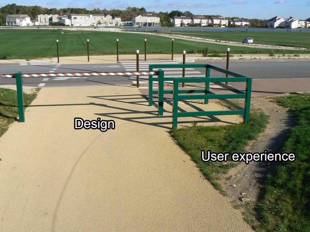
A colleague recently sent me the following picture. It appears to have done the rounds on the internet already, but I’d not seen it – and it sparked an idea.

“User Experience” and “User Interface” are two terms that people use interchangeably fairly often. If you read my last blog however, you will know that these terms mean very different things! Previously I used the analogy of a park, where the “pieces” of park such as the road or gate represent your UI, and the layout of those elements were your user experience. This image is a perfect example of the two working together – badly!
“If the user isn’t having a good experience, your clients aren’t just going to circumnavigate your bad design and carry on. They’re going to go to your competitors!”
“Desire-paths” as I’ve discovered they’re called – thanks to reddit.com/r/desirepaths – are an interesting expression of human nature overcoming boring design. I strongly encourage you to have a look at the link (warning: it’s a bit of a time-sink). When you apply this to software design however, a crucial difference must be observed: if the user isn’t having a good experience, your clients aren’t just going to circumnavigate your bad design and carry on. They’re going to go to your competitors!
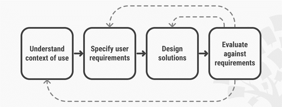
What we can learn from an example like this is that good UX design should be built around the needs and wants of its user-base, rather than dictate to them. If your users are wrestling with your designs or employing unconventional methods to achieve their work, you need to acknowledge this and begin to adapt your design to meet those needs. This User-Centric methodology is an iterative process, and this diagram from Interaction Design outlines this designer’s journey perfectly:
The way Accountagility works with its clients gives us an absolutely invaluable insight into how our product is being used. When designing a particularly complex new feature or defining some new business logic, our clients are often found in our offices sitting with a set of dedicated developers. This builds a symbiotic relationship for both parties; our clients receive one-on-one consultation and our developers and designers get to see first-hand how ORYX systems are being used in the real world. This allows us to “Evaluate against requirements” and see what steps need to be taken next. Are we able to design a solution for their requirements immediately? Or do we need to evaluate further with a workshop to understand the context of their use and outline their requirements? This research is fed back to our wider team and enables improvements across the whole system.
This research lets us create and map out “User Personas”, fact sheets capturing a number of key attributes about archetypical “users”. As our core users are in the finance function, we create personas for the FD, CFO, Accountant, Junior Accountant etc. We then map out user journeys for each of those personas, getting a feel of their day to day tasks, workflows, and how they get from point A to point B.
“If you get the UX right, your users won’t have to forge their own path.”
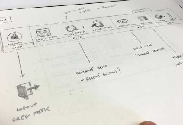
With these personas in mind, our designers then sketch wireframes, a visual guide depicting the page layout, content, interface elements and navigational system. Wireframes lack the typographic style, colour and graphics since the main focus lies on functionality, behaviour and priority of content. Functionality changes can also be improved quickly, adding more clear Call-to-action elements, drag-and-drop modules, switching the navigation, making the page more scan-able etc.

With these wireframes tested and approved, you can start to add branding elements, focussing on style, colour, and tone, bringing us full circle back to UI!
Hopefully this gives you an idea of not only the importance of the User Experience, but the value of – and amount of effort required –delivering a great UX cannot be understated. If you get the UX right, your users won’t have to forge their own path.”


