Much Ado about Image
To who ever may have stumbled across this, welcome! With the deluge of columns and articles published online these days, I want to thank you for taking the time out of your day to stop by and to read my column. My name is Jack Murray and I’ve been the Pre-Sales Manager at Accountagility for eight months now, after two years here as a Solutions Developer.
As another year approaches its end – a fact I find hard to believe, despite its stunning regularity – Accountagility are looking ahead to the future. We will soon be completing the final stages of a company rebranding programme, and are gearing up to release ORYX 2019. In the spirit of new things I’m going to begin posting short pieces every couple of weeks that discuss some of the common problems that I’ve seen raise their heads, both within Accountagility, and in the broader FP&A sector.
Creating ORYX 2019 has been an interesting challenge for us, hitting one or two roadblocks that we had to overcome before we could finally push it out of the door. In addition to a whole slew of new features and performance enhancements, something our team have taken to heart is a fairly radical overhaul of our UI and UX (User Interface and User Experience) elements. My background in software development and 3D / Graphic Design (originally for video games!) was leveraged and we achieved some remarkable improvements in a really short time frame.
But why does this matter?
Serious design changes in software can be hard to achieve. Often an “if it ain’t broke, don’t fix it!” approach to UI/UX can seem very appealing; it seldom appears an area of much importance when allocating time and resources, especially compared to R&D (a large part of Accountagility’s development cycle). But when you stand still, the world still turns around you. The advent of smartphones and tablets has started something of an interface-arms-race; when the incredibly slick experiences of iOS or Android have become practically passé, updating your software’s old and clunky front-end is not just a luxury but ultimately a necessity for your software to be taken seriously.
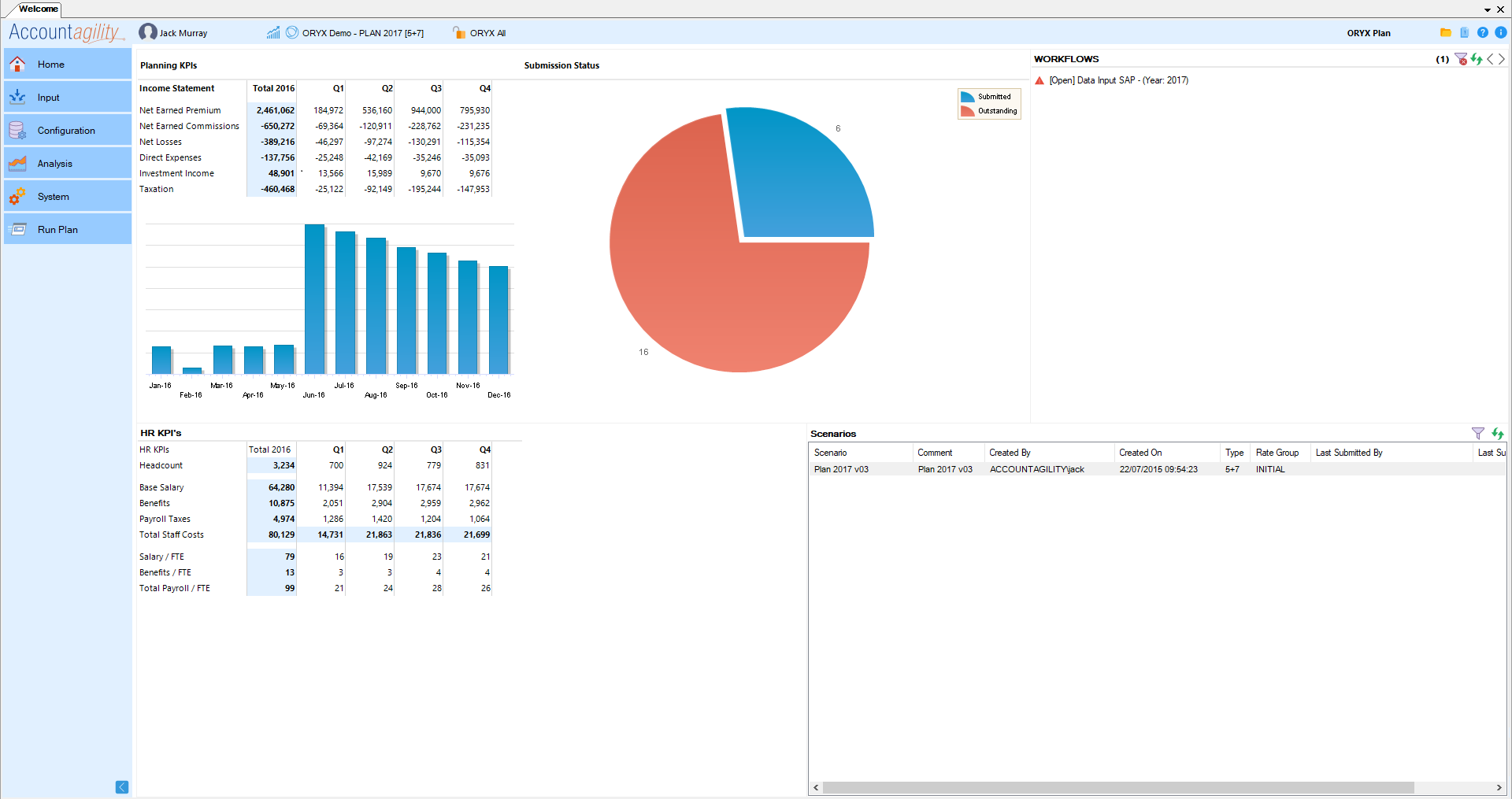
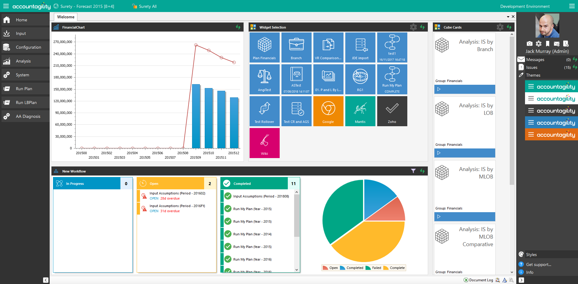
So to kick off my series of blogs, next issue I’ll be diving headfirst into the question: “Does Image Matter?” Starting with our UI, we’re going to cover the hows and whys of everything we’ve done and I’d really love to hear some feedback from you. I think this will be both interesting and valuable to anyone out there developing their own kit, and enable you to come to your own conclusions. Until next time, I’ll leave you with a single before and after of our ORYX dashboard to whet your appetites:
ORYX 2017:

ORYX 2019:
Did you spot the difference?!

Thanks for reading!

